
I have loved Windows and Windows Phone for a long time. Ever since Windows Phone 7 came out, my attention has been drawn to that weird and wonderful world of Microsoft. I own a Windows Phone, run Windows (to my friends discontent) and even own their screen mirroring device. However, in the last couple of months that love has been shifting. Windows 10 has been bugging me for a while. The update did not the update that love I had for the previous version of Windows. I did not want to believe it, however it has just slowly been happening, even though Satya Nadella, the CEO of Microsoft, wants the consumer to love Windows again. I want to explain why.
The Windows Release Story
For you to know why I dislike it, let me start about saying something about the release of it. After the disaster (in sales terms) that was Windows 8, there had to be a new version of Windows that was great again. They needed someone who could turn this around. They fired the head of the Windows team and even Microsoft got a new leader, Satya Nadella. They started building a new Windows that should become better. They changed a bunch of things around. Windows 10 is the first version that was not released in one big go, where it was complete secrecy until launch. Instead, this version was released in many smaller chunks, released every so often to the Windows Insiders, beta testers who could give feedback before the actual release. This was to make sure that the final version was made for the people who were going to use it and to make sure that they would not again have such a negative outcry from the community. This way of developing Windows has been a great addition for the Windows lover and Windows user, but however also brings downsides that need to be fixed.
They listened to the feedback of the community. This on its own is a great thing, because if they make large mistakes or if we find ways to make Windows a better operating system they can change that. On the downside, if you listen to too much feedback, you will most likely end up with a mediocre product, because if you listen to everyone, then you have to compromise and when you have to compromise, nobody is happy.
Talking about an unfinished product, Microsoft decided in an early state that it would no longer create a Windows 11, but would continue to add features to Windows 10. This means that if you paid for Windows 10, you can use it for all of eternity. This is a great idea. It means that in the future developers will never again have the problem of having to support an outdated version of Windows, which means that the amount of people you can easily reach, becomes much greater. The downside is that you do not really have a date where something needs to be finished and polished. “We’ll do that later. We’ll fix that in another version.” The reality is that something might never get fixed.
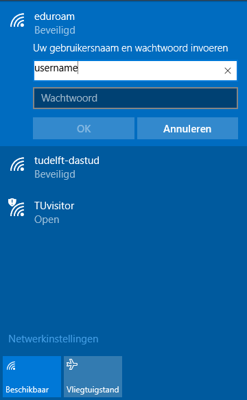
You can find lots of examples of these small and bigger errors that the paragraph above describe. For instance a small one is when signing in to a network with a password, the textbox is not centered.
Argh
Islandwood and Astoria
As you may (not) have heard, Windows is suffering from an app gap. The Windows ecosystem does not have the newest apps that Android and Apple has. To combat this, Microsoft announced a tool called Islandwood and Astoria, which would enable developers to run existing Android and iPhone apps on Windows. As I now see how they want to implement this, it would be terrible for the Windows eco system. Windows has their own design language, as does Apple and Android(google). If you would combine those, you would end up with a giant mess. Not only would this discourage developers to create good native Windows apps, it would also discourage them to use OS native features, like Cortana integration and inline responses. You only have to look at the disaster of blackberry to see how big of a disaster out could be. It would be much better if you could only port the backend code, the part that contacts a server and handles storage, as it would force the developer to design and build for the Windows platform, where he needs the follow the rules of the eco system. Recently I have seen some encouraging news on this front. Microsoft stopped working in the porting of Android apps to Windows and they have bought Xamarin. This is a company that created a way to build one app and then run it on iOS, Android and Windows Phone. Because Xamarin is built for cross platform creation, this means that when you are creating a Xamarin app, you have to think about how it will look on multiple platforms, which the Xamarin frameworks helps you do, instead of mindlessly porting an iPhone app. I would be happy to use an app with an iPhone heart and a Windows face.
Universal Windows Apps
With the launch of Windows 10 came another way to encourage developers to develop for the Windows platform. These were called Universal Windows Apps and they promise that once you have written code once, that you then can run them on your phone, the desktop, Xbox and Hololens. Until now you can only develop for the phone and desktop with Xbox on the way and Hololens apps further, as it will only be released shortly. The problem that I have with Universal Apps is that it is a lie. You cannot design apps for multiple screen sizes. This is impossible.
Using a mouse is fundamentally different than using a small touch screen or a joystick or hand movement. You want/need to have different animations, interactions and screen layouts which is almost impossible to fit inside one app. Think about the iPhone and Mac, Android and Chromebook. These pairs are all made by the same (very competent) company and they probably had a good reason for doing this.
When developing for Windows 8.1, you had multiple parts of a project. A core project, where the parts that you can reuse reside, like storing data and getting information from a website, and then different projects for the Phone and Desktop. In Windows 10 however, they changed it with Universal apps. With Windows 10, you build one app and then create some code that dynamically checks if you are on the desktop or phone and then changes the screen layout based on this. This results in way more complexity than should be necessary. The most important problem I see however, is that with this change, you are encouraging developers to be lazy and not think outside of the box or rethinking their entire app if the screen resolution changes. Even better, I think that you should, because if you have more pixels, a different layout could relay a lot more information. One thing that we have learned from the early Windows Mobile, is that it is a terrible idea to scale down a desktop version to a phone. Let’s hope they do not make the same mistake again.
Cortana
When I first heard about Cortana I was really happy. THE voice assistant of Windows, that was not only put together very well (they talked to real assistants to get it just perfect) and when coupling it with Windows Phone and Windows Desktop the amount of data they received would make it really perfect. Then came the really, really bad news. It would not be available in my country or, better said, anywhere outside the US. This made me really sad. To make matters worse, at the start they advertised to everyone (outside of the US) that Windows 10 will come with Cortana, the great voice assistant. Even now, sometimes you will find a small banner that will ask you if you want to use Cortana, which always gives you that glimmer of hope, that it might be possible this time.
Desktop Cortana
On the Windows desktop, you don’t really miss it. When you search for something it shows a nice UI. Only when you know that there should be a Cortana, you understand why it differs so much from the start menu.
Phone Cortana
The phone is a whole other story. This is a complete disaster. Cortana is bound to the search key. In previous versions you could use search to search for nearby places to eat, search for files located on your phone or search the internet. With the “new” and “improved” version the only thing that the search feature can accomplish is doing a Bing search on the web. Not only that, but it is doing it inside of a web browser. They did not even go to the trouble of making an integrated version into the app. To make it even worse, Windows Phone 8.1 had a way for non-US located users to use an English voice assistant, which could do basic things, like call and text, but also talk to apps that supported this. So not only do we not get the new and great Cortana, we also get banned from using the old one.
Feedback App
One of the ways that Microsoft has been asking feedback, is by asking us. At first this was done by using a service called UserVoice. However when asking every Windows user what they think about their experience it is a better option to create your own feedback platform. You don’t have to rely on that service and you don’t have to pay for the massive amount of storage you need to store all of the feedback. They have done a good job for the most part. The only big problem I have with it is, that I can only see feedback from my own country. Partially this is good, some people can’t read/write English as well as others and this demographic is also a large part of Windows users, but I would like to see what the world thinks about Windows. Right now the feedback app is largely a Ghost town with most feedback items having around 5 votes with the top one having 900 votes (about getting Cortana to my country). The splitting of the userbase in their demographics also has the downside of not feeling like my regions ideas matter. The feedback team has assured us, that they do data mining on every piece of feedback gathered in their enormous system. However, to an outsider this still gives a feeling that you are giving feedback to wall. The old feedback had the great option that they responded to the top feedback suggestions and even told us when they started on it. Windows still uses it for other parts of their system, so you can look here for an example. This way everyone could see that they were listening to feedback and were actively working on it. Right now, they don’t even respond with text. The top (Cortana) feedback has a link to an English article, which is hidden away in easily missed text: “More information”.
Another drawback of using country based feedback is that is useless to share links of feedback ideas. I can only open feedback from other countries if I have the link to that item. I have to click the link that people create to view it. Furthermore, right now out of the top 10, 5 are duplicates asking if we can have Cortana. This does not feel organised. I wouldn’t mind, going over them, marking them as duplicates and connect them to their worldwide counterpart, so that even if you want to give feedback in your language, the Windows team can still see, what we want to have and if they respond to a request that everyone around the world can hear it. All this discourages me to use the feedback app to give the feedback in the feedback app.
Also as a side note, it would be a great idea to make this a way to have a StackOverflow type of website, where people can post their problems and other people can help you find a solution. Embed this to in the help app and you have a treasure trove of helpful information to give consumers.
Design of Windows 10
With Windows 10, it feels like the designers had no big plan, no overarching design. It feel more like everything was design separately. More “I need to create this piece of software and I need to do it fast”, than “I need to make this piece of software and it needs to work perfectly and fit in within the design of Windows 10”. This in sharp contrast to Windows 8, where everything was perfectly and strictly tied to the design of Windows 8, which might not have worked as good, but you’ve got to admit was beautiful.
The hamburger menu
After many years, Microsoft has decided to include a hamburger menu inside their apps. There was a huge outcry from the Windows community, including myself. However, since then I changed from “You should never use a hamburger” to
“First, you shouldn’t use a hamburger menu if you don’t have to. Second, there are plenty of cases where you need to use it, and that’s perfectly fine.” — Source
Mostly because of this article from someone who designed the office apps (Word,Excel, etc.) and it really explains why they did what they did and what choices they made. Today many apps still use a hamburger menu, however Facebook has removed their hamburger menu and saw the user interaction rise. Others, too. This is good reason why you wouldn’t want to use a hamburger menu, however some apps still use it as a lazy way to navigate, without thinking about better ideas.
The apps of Windows 10

These are the new Windows 10 apps. The Outlook, News, Clock and Store app. When looking at the UI, they have almost nothing in common. Let’s first compare the top apps, the Outlook and News app. If you look at the navigation UI they both have a hamburger menu. The only thing is that when you click the hamburger menu on the news app it does something completely different than what the currently extended outlook app extended is:

It flows over the content, instead of sliding over. That is different for no reason at all. Now also notice that someone failed at escaping the apostrophe in Video’s, which is just sloppy. Also there is no reason to use a sidebar at all if you just move some items around. (See app1)
Then we have differences between the lower 2 apps. The Alarm app looks good in comparison to the store app, but in comparison to the old one is a sad copy.

Windows 8 Alarm App
Look at that beauty. In comparison to that the Store app just feels terrible. In the alarm app, when you tap an item, the content slides in with an animation. When you click any of the navigation elements in store app, everything just disappears and the new content just appears whenever it feels like it. Even when you look at the screenshot provided above, it just feels like someone built it in an evening. And please let someone do something about that terrible search box border.
Then we have the gigantic difference between the top and bottom apps. The navigation UI is completely different. Where the top apps have top to bottom as their main UI, the bottom two have a pivot like navigation. This is just unforgivable. How can you expect developers to make apps, when you don’t even find the time to create an overarching set of rules of design to follow? Of course you can deviate somewhat from these, but a difference this big is unforgivable for an OS-made app.
This is just a small example there are many more examples of bad design in Windows 10.
Breathing space
One thing I first noticed on the Desktop was that the UI in the new version feels more crowded. It feels like the Windows 8 version tried to take a much space as possible, by starting with a blank space and then adding things and Windows 10 started with putting all the information down and then trying to make it look good.

Old

New
One of those examples is the lock screen of the phone, where the text is 2x bigger than on windows 10. With Windows 8, they took as much space as they could get, which results in a giant clock on your lock screen, which is always readable. In Windows 10, it is way smaller, which has no reason for it.
The battery icon
Another small change that I couldn’t understand, was the change of the battery icon, when your battery was low. It took me about a week to finally get what it the icon was supposed to represent

What is it?
If you are like me and also cannot get what the vague icon is, after all this time, my best guess is that it is a match. I have no idea what the match is supposed to represent. “Your battery is so low, it has the energy of a match” or “Please light your phone on fire”. I also do not get, why they had a reason to change it. With Windows Phone 8 you had a giant heart, which would indicate that “you had to add love to charge it” or better “we love your battery life, so we turned some things off to last a bit longer”. At least you knew what it was. This is another thing that was changed for the sake of changing it.
Pill
Then we have the ugliest UI element that Microsoft has added with Windows 10. The pill. Let’s start with the name. Who would want a Ui called the pill. It already sounds terrible. Look at it.
The pill is a switch UI element which can turn settings on and off. You would like it to be a switch, but when on a phone, for me, it does not feel something that you actually feel happy using. Also it is really small, which means that if you have a large finger it is hidden behind it. Now let’s compare it to the switch from Windows 8.

It looks like a mad scientist switch.

It is glorious. The on and off state feel like they matter. You want to use it, just for the sake of using it.
Desktop Windows
The volume slider
The volume slider, you might ask? What is wrong with the slider? You might not have even noticed it, but Windows 10 added a new volume slider. It did not replace one, it added no new features, it just added one. This makes the total number of volume controls at 3. Version one is still left over from Windows 7, which you can find by right clicking on the sound icon in the task bar and then “Open Volume Mixer”. There is the one from Windows 8, which you can find by, if you change the volume by using the function keys on your keyboard, which I personally find beautiful. And then you have the one they added in Windows 10. You can find this one by tapping on the sound icon in the taskbar. I cannot for the life of me think of a reason why they added another one. If you want to change the sound, the Windows 8 version still works amazing with a play/pause function when you have a windows 10 app playing something. If you need to change the sound of a single application or change the output device, the Windows 7 version is the one to go. If it was meant to replace the Windows 7 volume options, they should have made it complete and not put a half-baked feature in a “finished” product. If your intention was to replace the Windows 8 volume slider (please don’t), then why can I still use the Windows 8 one?
On a personal note, I think that the new slider is hideous. It has a slightly different shade color than the taskbar, which means that it just looks weird next to it. And then it tells me what audio device it is playing from, but cannot change it. Then why should I care? I am just changing the volume. Or what is its purpose?
Anyways. I did not think anyone could talk this long about a volume slider. The volume slider is a perfect example of something new that was not really finished, either because it would be done “later” or did not have time to fully develop it or even worse, some marketer thought that it would be a great idea to put a new volume slider in, because it was a new feature.
The start menu
Oh, the start menu. Although the Windows 8 version was not perfect, it was a new start menu that was going into a new direction. Maybe a better one. However with Windows 10 they decided that they needed to bring back the old start menu back and created a weird hybrid between the Windows 7 and 8 one. The new start menu isn’t bad, there is just one thing that annoys me. Why isn’t it full screen? I know that there is an option in the settings to do it, but still this a weird idea. When you press the start button, 75% of screen becomes useless, because it mostly says nothing useful and as soon as you click out of it, the start menu disappears. Why wouldn’t you use the entire screen? This problem is also found in the search menu. Especially when the searching is slow, you might want to click somewhere else, but you have to wait until the search is complete or your search disappears. The only reason I might think that one could use this, is when you want to search something that is on the right side of your screen and you might want to type it letter by letter. Why you wouldn’t use copy/paste, I don’t know, but it might useful.
Action Center
Oh the action center, the horrible abomination. On a developer point of view, the notification center has some weird quirks. Desktop Apps (not the fancy new apps you can find in the app store) can only add things to the notification center, no removing, silent adding or other features that make a notification center worth using, which means that some apps might publish the same message three times or that outdated notifications are still in the action center and therefore not “actionable”. Even the built in email app from Microsoft, which does have the above, has this problem.From the ux/user point of view it is a really sad copy of the Windows Phone version. It is like someone copy pasted the notification center, moved the quick actions down and called it a day. It feels like almost no design work has been done at all. For instance, when you remove a notification from the action center, it removes all the ones below it and adds them again, at least this is what the animations are telling us. Try it out yourself. Did no one take the time to polish it, to make a pretty list change animation?

Windows 10
Then you have the quick actions. These work great on a phone, but are lousy on a desktop. They feel cheap and lazy. The better option would have been to take the “actions” from the old Windows 8 and add the new actions to that instead.

Windows 8
Windows phone
My love for windows phone can be summed up in three words: “It just works”. Everything in the phone was designed with this point in mind. This might not have been intentional, but it was the thing that made me fall in love with Windows Phone. It was the thing that made me encourage anyone who wasn’t that great with software to use Windows Phone, because most of the time it did not feel like software, but a simple user friendly “push this to do this”. That was until Windows 10 came around.
“Windows 10 Mobile, from a long list of missing apps, to bugs and crashes, to basic functionality that’s only partially there if at all, still has a long way to go”(Kip Kniskern).
Even though Windows 10 for the desktop has been released 8 months ago, the real new features of the phone are slim, the only notable being inline responses for notifications, updated Outlook app and new background options. Even Microsoft has a list of things you will lose when upgrading
Login
The log in screen is a little buggy, which means that sometimes it takes a little bit longer to log in. This means that you cannot have good muscle memory, because when opening the password box, sometimes works in one go and sometimes takes half a second. This would not be a problem if I used every other day, but this is the thing that you use everything you see the screen.
Picture
Then you have the picture picker. The speed on windows 8 is amazing compared to Windows 10. On Windows 10, when opening the picture picker, you have to wait 10 seconds until it refreshes to the latest list of pictures you took, then you have to pick the correct photo. Sometimes, when you only want 1, it does not let you, so you have to pick 2 and then unselect the second one. After this you have to hope that you get back to the previous app. This might take a few tries, because it crashes. A lot. Then, if it does work it turns out that the picture you unselected was also sent back, so in the app you have to make sure that you delete the wrongly selected picture again.
Eduroam
I am a student and on campus we have a Wireless Network called Eduroam. When I went to the first introductionary courses, they told all the students that to connect to the network with Android and Apple, you had to follow a long guide and fill in the exact settings at certain places to get it to work. They usually don’t have a guide for Windows Phone, because as the joke goes: “Who uses a Windows phone?”. Imagine my surprise when I tried to login and it just showed me 2 fields: A username and password. Of course I made fun of my friends that there were using a stupid phone where they had to enter all the settings. It felt like you were loved by the team that made this, who did not want you to go through the horrible setup. With Windows 10 that love was gone. I now too have to enter all the settings.
Lag
The lag. Windows 10 Mobile is slower than Windows Phone 8.1. From the benchmarks in the source, you can see that Windows 10 for phone is not made for lower end devices and that is noticeable throughout the operating system. Some apps boot slow and take many seconds to load or stay forever on the resume screen.
Upgrading
That is why they probably decided not to upgrade lower end phones to Windows 10. That is the thing that has made me really sad. Not that my phone is not in the list to upgrade to Windows 10 or that I got no warning that this would happen or that some phones that were promised to get it did not get it or that it is another broken promise by Microsoft or that it took them more than a year (which let to a bunch of other problems) or that I can still enrol to the insider program (and run Windows 10 anyway), but that it is another let down for the eco system. Around 50% of the phones currently in use (most of which are Windows Phone 8.1 devices) will not get Windows 10. One of the things I always loved about Windows Phone is that so many of the phones got a new update and that upgrading got Microsoft closer to its goal of running a billion devices on Windows 10. It is shooting itself in the foot here. It is fragmenting its user base even more, so building apps for the platform is just useless. No one was building apps before and now with so few people using Windows Phone 10, Microsoft has just given them more reason not to. Furthermore you are letting down the windows fans, who stuck with you for this time.
Conclusion
As I look into the future of Windows I see some really good things, but also a lot of hurdles. I think that Windows Phone is still one of the best phones out there to use. I fell in love because the idea of Windows Phone: “The goal was a people-centric rather than app-centric model.”- Source. Although apps are a big part of a good phone it is not everything and I am afraid that focusing too much on has been a grave misstep, even though 80% of the apps you install are no longer in use after one week. Spend more time to (re)create parts of the OS that are amazing. Please stop rebooting Windows Phone. You have removed some really great functionality for the sake of renewal. Start working on things that will make my life a little easier and fun. Create beautiful and thoughtful UI. Then I will love Windows once again.
Extra
Windows Phone
In this story I talked about Windows Phones. The new name for the Windows Phone is Windows Mobile. Not only was that a horrible marketing decision, because everyone knows Windows Phone, it also makes us think of the terrible previous Windows Mobile endeavor.
App1: Removing the hamburger menu
To properly explain how you can remove the sidebar, I should translate the items in the sidebar, these are the items in the sidebar, from the top to bottom: Preferences, local news, videos and send feedback. The bottom two items are my account and settings. Let’s start.
The “Preferences” does exactly the same as pressing the pencil at the right top. We can lose that. Local news and Videos could become their own categories at the top, maybe with a ‘|’ to mark that they are different. Gone. Then you could put the feedback at the top next to the pencil. Poof. I have no idea, why you need to know, why I need to log in with my Microsoft account to read news. Leave it out. Settings could also go next to the pencil. Even more so, preferences is actually part of your settings, so move the preferences in there. Now we are left with no sidebar and 3 buttons at the top, which means the content, could take the entire width of the screen.
